
There is a moment in every garden season when you stand back, squint a little, and think, Why does this bed look busy, even though I love every single plant? I have had that moment more times than I can count, especially when I was first learning perennials and collecting plants like souvenirs.
The good news is that “polished” garden color is not a mysterious designer gift. It is mostly a few repeatable choices: a main color, a supporting color or two, and a plan for contrast. Once you understand how the color wheel works in a perennial bed, you can make even a mixed planting look intentional.
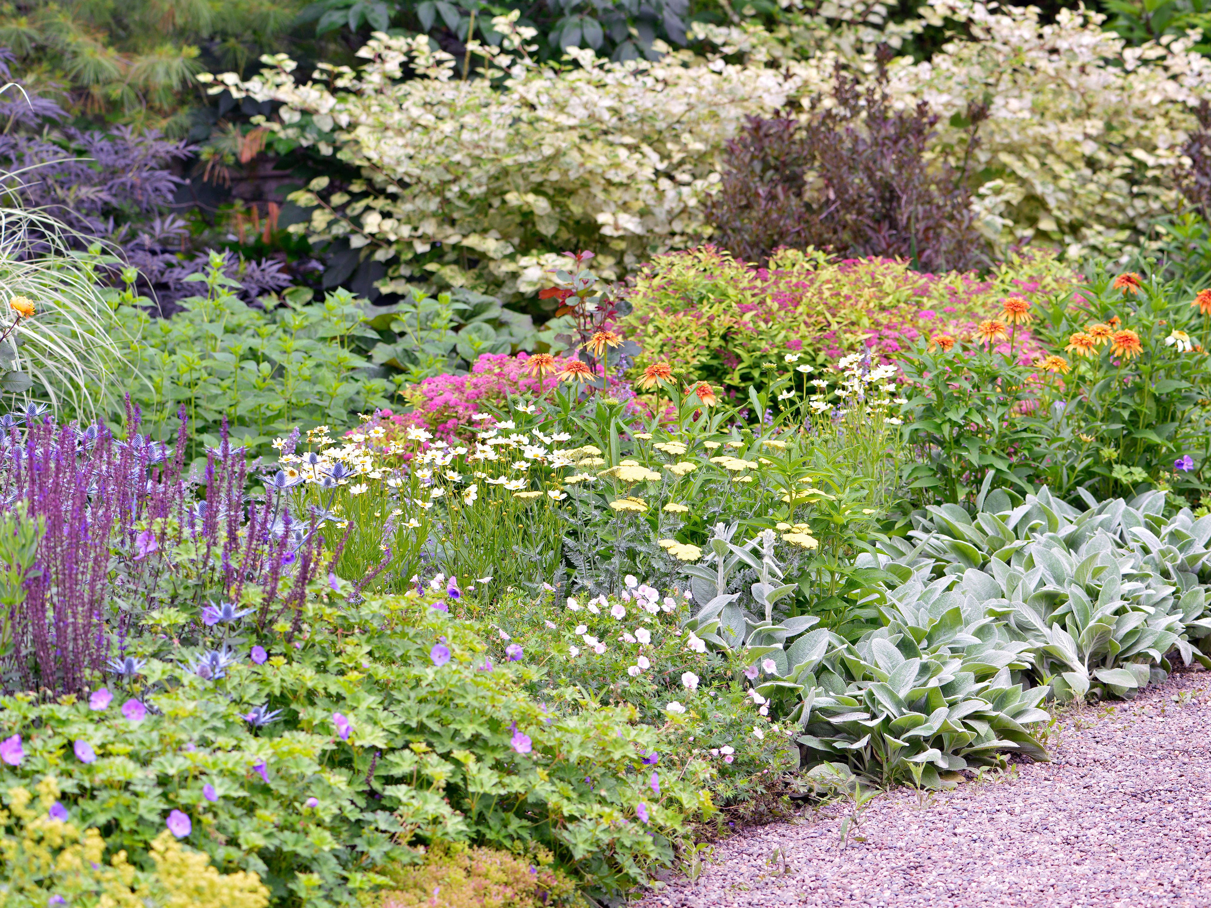
The color wheel, garden style
You do not need to memorize art class vocabulary, but a few basics will make planning much easier.
Hue, value, and saturation
- Hue is the color family: red, orange, yellow, green, blue, purple.
- Value is how light or dark a color is. Pale lavender and deep violet are the same hue with different values.
- Saturation is intensity. A neon magenta phlox reads louder than a soft, dusty pink phlox.
In perennial beds, value and saturation matter just as much as the hue. Many “color clashes” are really intensity clashes, like one screaming hot-pink bloom next to a set of gentle pastels.
Warm colors often come forward
Warm colors (red, orange, yellow) typically feel like they move toward you, while cool colors (blue, purple) often feel like they fall back. It is not a hard rule. Light levels, background, and even flower size can flip the effect. Still, it is a handy trick in small yards: place warm accents near the front edge for energy, and let cool colors drift toward the back to create depth.
Green is not just a background
Foliage is the glue in perennial design. All the greens in a bed are not the same, and their undertones shift the way flowers read:
- Blue-green foliage (many conifers, some hostas, Russian sage) calms bright flowers.
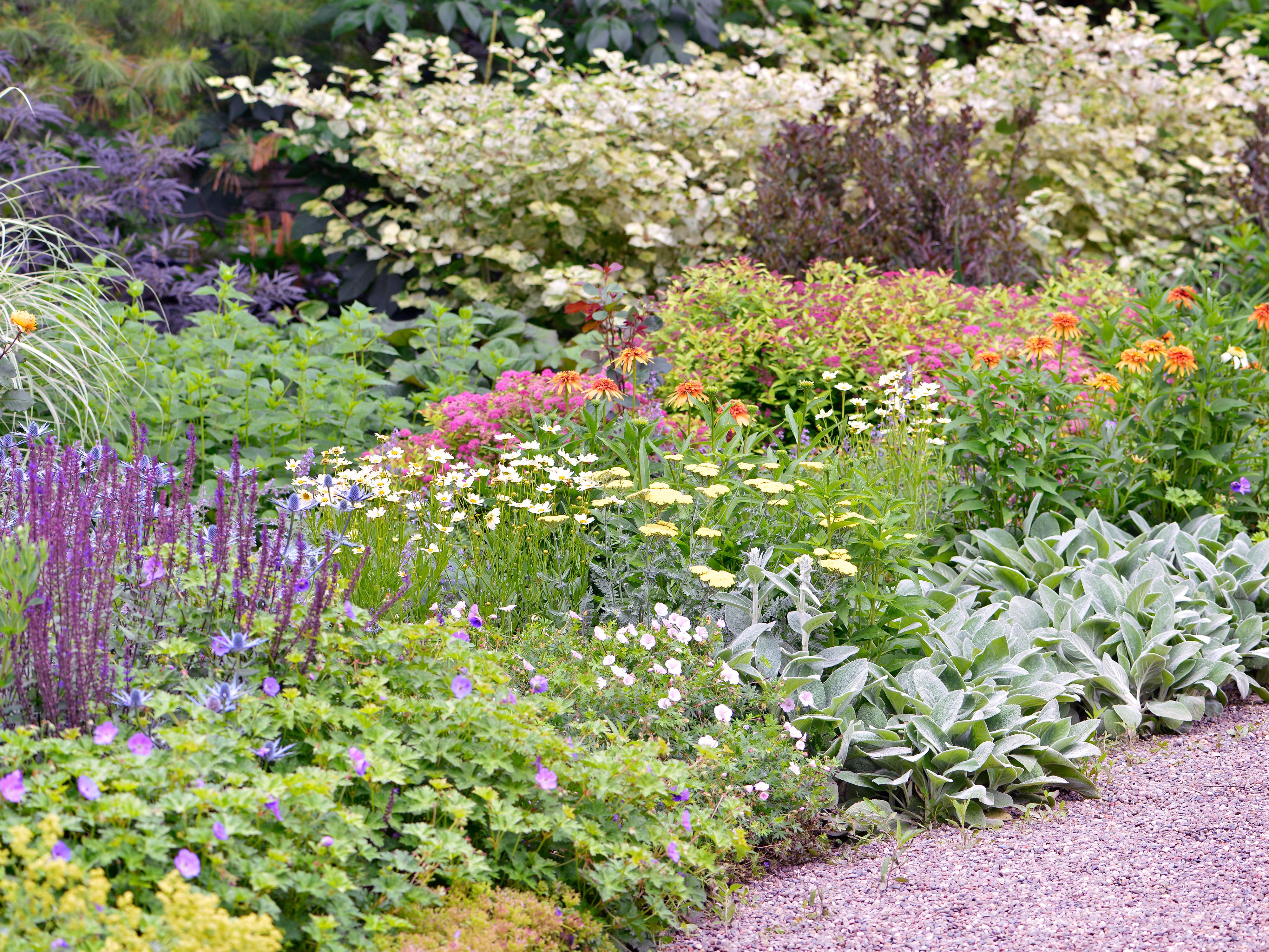
- Yellow-green foliage (chartreuse heuchera, golden sedges, some spireas) brightens shady corners and makes purples look richer.
- Deep green foliage makes pale blooms feel crisp and clean.
Light changes everything
One more reality check: the same color can look completely different depending on where it grows. Full sun tends to intensify saturation (especially hot pinks, reds, and oranges). Shade often mutes color and pushes things cooler. If your palette feels “too loud,” the fix is not always a new plant. Sometimes it is simply moving the brightest color into part shade, or buffering it with white, silver, or deep green foliage.
Start with an anchor color
If you do only one thing, do this: choose an anchor color that will show up repeatedly through the bed and through the season. Repetition is what makes a border feel like a design, not a collection.
Good anchor colors for perennial gardens tend to be colors that have lots of plant options across spring, summer, and fall:
- Purple and lavender (alliums, salvia, catmint, coneflower, asters)
- Pink (bleeding heart, dianthus, phlox, coneflower, sedum)
- White (candytuft, shasta daisy, anemone, hydrangea, gaura)
- Blue (brunnera, baptisia, salvia, balloon flower, asters)
Then decide: do you want the bed to feel soothing and blended, or lively and high-contrast? That choice determines which palette style to use.
A quick note before we get into plant lists: what blooms “in spring” versus “late spring” depends heavily on zone and microclimate. Swap in local equivalents that hit the same bloom window and you will keep the color story intact.
Monochrome beds
A monochromatic bed uses one main hue, then plays with value and texture. In practice, it is one of the easiest ways to get a “professional” look because it automatically limits visual noise.
Keep it from looking flat
- Use at least three values: one pale, one mid-tone, one deep.
- Mix bloom shapes: spikes, daisies, umbels, and airy sprays keep the bed interesting without adding new colors.
- Lean on foliage: silver, deep green, and chartreuse act like accents even when flowers stay in one hue.
Example: purple, spring to fall
- Spring to late spring: alliums (purple globes), creeping phlox in lavender, early iris in one purple family
- Early summer: catmint, salvia ‘Caradonna’ (often late spring into summer)
- Mid to late summer: coneflower in pink-purple tones, verbena bonariensis for height
- Fall: asters in lavender to violet, ornamental grasses for tan contrast
If you are nervous about choosing colors, monochrome is the confidence builder I recommend most. It teaches you to notice texture and timing, which is half of garden design.
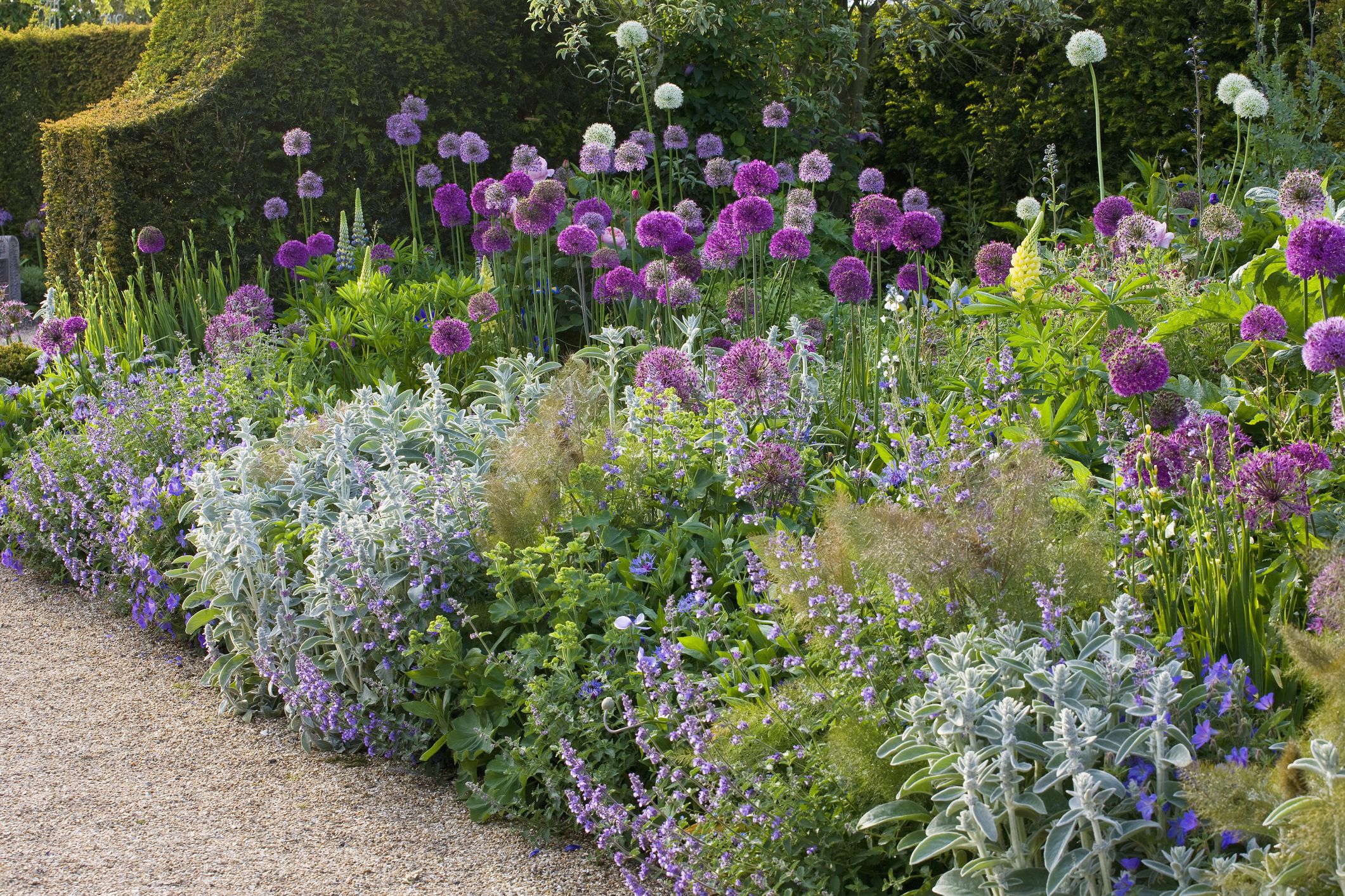
Analogous palettes
Analogous colors sit next to each other on the color wheel, like blue, blue-purple, and purple, or yellow, yellow-orange, and orange. This is the palette style that feels naturally abundant and romantic, even in a tidy bed.
My rule for flow
Pick two adjacent colors as your main story, then use the third neighbor as the occasional accent. If you use all three equally, it can start to look like confetti, especially when all three are highly saturated and appear in equal-sized blocks.
Example: blue to purple
- Blue: baptisia (late spring), perennial geranium ‘Rozanne’ reads blue-violet, hardy ageratum (Conoclinium coelestinum) for late summer
- Blue-purple: salvia, catmint
- Purple accent: alliums, asters
One friendly caution: hardy ageratum (blue mistflower) can spread aggressively in favorable conditions. If you garden in a place where it loves life, give it boundaries or treat it as a “watch this one” plant.
Example: pink to orange
- Pink: dianthus, tall garden phlox, coneflower in rosy shades
- Pink-orange: geum varieties often live here beautifully
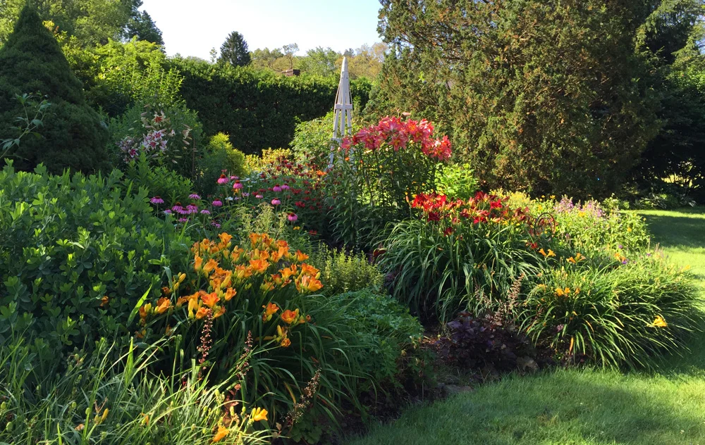
- Orange accent: daylilies, butterfly weed (Asclepias tuberosa)
This is also where “peach” becomes your best friend. Peach bridges pink and orange, and it makes a warm palette look intentional instead of loud.
Complementary palettes
Complementary colors sit opposite each other on the color wheel: purple and yellow, blue and orange, red and green. In a perennial bed, this contrast can look electric in the best way, but only if you control the proportions.
The proportion trick
Use a dominant color (about 70 percent), a supporting color (about 25 percent), and a tiny punch (about 5 percent). That 5 percent is where the “wow” lives, and it is also where people tend to overdo it.
Example: purple and yellow
- Dominant: salvias, catmint, lavender, asters
- Support: yarrow in soft yellow, coreopsis, rudbeckia in yellow to gold tones
- Punch: a few deep violet alliums, or a small run of the brightest yellow you can handle
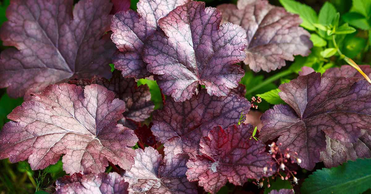
If you want extra drama without introducing a new flower color, add a dark accent instead, like a near-black heuchera or a deep burgundy sedum. Think of that as a grounding neutral, not part of the complementary pair.
Example: blue and orange
- Dominant: nepeta, blue salvia, balloon flower
- Support: orange daylilies or orange geum
- Punch: a handful of orange butterfly weed, or coppery grasses for warm glow
One gentle warning from experience: bright orange is powerful. A little goes a long way, especially in a small front bed.
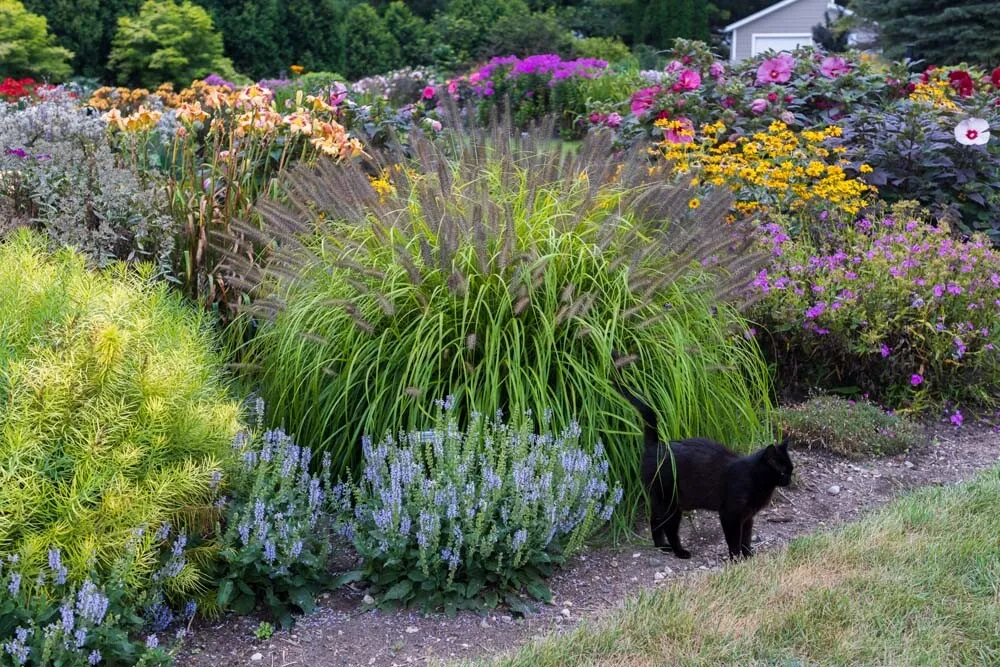
Neutrals that elevate color
Some of the most beautiful “color theory” moves in gardens are not colors at all. They are neutrals that calm the scene and let your chosen palette shine.
- White brightens shade and makes saturated colors feel crisp.
- Soft creams blend warm palettes more smoothly than stark white.
- Silver foliage (artemisia, lamb’s ear) cools down hot colors and adds a clean, designer feel.
- Deep burgundy foliage (heuchera, some sedums) adds contrast without adding new bloom colors.
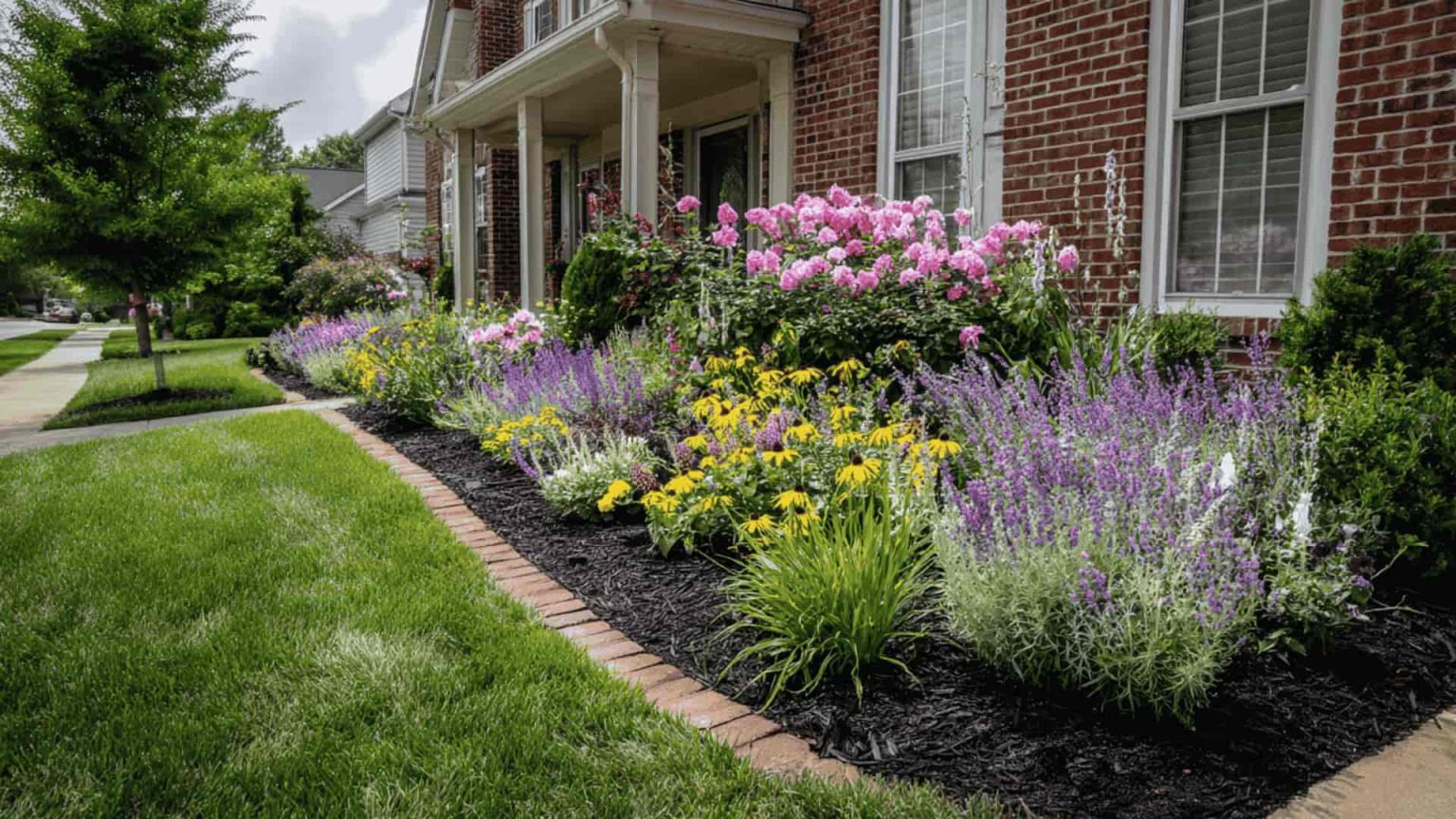
And do not forget the biggest neutral of all: mulch or gravel. The ground plane changes the whole mood. Dark mulch makes colors look richer. Light gravel makes the entire bed feel brighter and more Mediterranean.
Think in seasons
This is where perennial color theory becomes uniquely tricky. Perennials do not bloom all at once, so your palette has to hold together as the cast changes.
Repeat your anchor in each window
If purple is your anchor, make sure you have at least one purple option in each major period:
- Spring to late spring: allium, iris
- Summer: catmint, coneflower, verbena
- Fall: asters, mums if you like them, late salvia in mild climates
Structure keeps it cohesive
Even when the flowers shift, repetition in foliage color and plant shapes keeps the bed feeling consistent. For example, if you repeat mounding plants along the front edge and add a few airy, see-through plants for height, the structure stays steady while colors rotate.
Maintenance helps the palette hold
Deadheading and timely cutbacks can extend bloom and encourage rebloom on many perennials. That matters for color planning, because it keeps your main hues on stage longer instead of leaving a surprise gap.
A simple palette method
If you want a practical process, here is the one I use when I am planning a new bed or fixing an existing one.
- Choose a mood: calm, romantic, bright, dramatic.
- Pick an anchor hue you love and can repeat.
- Select a palette type: monochromatic, analogous, or complementary.
- Decide your neutrals: white, cream, silver, burgundy foliage, and your mulch color.
- Limit your loud colors to small doses.
- Repeat in drifts: three of something looks designed, one of something looks like a spare plant you had lying around.
If you are editing an established bed, do this with a notebook and a phone photo. Circle the colors that show up repeatedly, then circle the colors that appear only once. Those one-offs are usually the “why is this chaotic?” culprits.
A quick before-and-after edit
If you have a bed that feels jumpy, it often looks like this: one hot red, one bright pink, one purple, and a few yellows sprinkled around, all at the same intensity, with no repeats. The edit is simple: keep the plant you love most as the star, choose one supporting color, then either repeat the third color in two more places or remove it. Add a neutral buffer, like white blooms or silver foliage, and suddenly the whole thing reads as intentional.
Common mistakes
Too many saturated colors at once
Fix: Keep one or two saturated stars and let the rest be softer tints, whites, or foliage-driven. If everything is bright, nothing is.
Ignoring undertones
Some yellows are lemon (cool), some are gold (warm). Some pinks lean blue (cool), others lean coral (warm).
Fix: When a pairing feels off, swap one plant for the same color family with a different undertone. This is especially helpful with pinks and reds.
Random pops that interrupt the flow
Fix: Either repeat that pop color in two more places, or remove it. Repetition is the secret handshake of design.
Forgetting foliage season
Fix: Add at least one foliage plant that looks good from spring through frost. Heuchera, hosta, sedges, and ornamental grasses do a lot of heavy lifting.
Quick palette ideas
Here are a few perennial-friendly color recipes that tend to look good in home gardens, even when the weather does not cooperate.
Soft and romantic
- Blush pink + lavender + touches of blue
- Neutral support: white and silver foliage
Fresh and modern
- White + cream + green, with texture contrast
- Neutral support: deep green and a little burgundy foliage
Sunny and energetic
- Purple + yellow, with yellow used sparingly if it is very bright
- Neutral support: gray-green foliage, tan grasses
Bold but grounded
- Blue as the anchor, with coral and soft yellow accents
- Neutral support: lots of green and a few silver notes
FAQ
How many colors should a perennial bed have?
For most home gardens, two to three main hues plus neutrals is the sweet spot. You can always add more later, but starting with fewer colors makes the bed feel cohesive faster.
Can I mix warm and cool colors in the same bed?
Yes. It helps to pick a temperature leader. For example, a mostly cool bed (blues and purples) can handle warm accents (peach or soft yellow) if the warm tones are repeated and used in smaller amounts.
What if my favorite plants do not match my palette?
Keep the plants you love, then make the palette work around them. Choose one wild card plant and repeat its color elsewhere, or buffer it with neutrals like white blooms, silver foliage, or deep green leaves.
Does bloom time matter for color planning?
Absolutely. A palette can look perfect in June and fall apart in September if your late-season flowers are a totally different set of hues. Try to include your anchor color in at least two seasons, ideally three.
A pep talk before you move plants
If you take anything from this, let it be this: great garden color is mostly editing and repetition. You do not need rare plants or a giant yard. Choose an anchor, pick a palette style, and repeat it in drifts. Then give it a season to settle in. Perennial gardens are slow magic, and color harmony gets easier every year you pay attention.